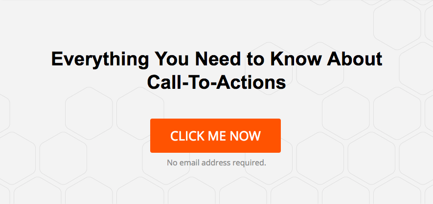
Potential customers won't make the action you desire unless you ask them to.
That means that every piece of content or marketing material should have a clear call-to-action (CTA in short), a desired action you want a customer to make.
But what kind of CTA, where, how many and what are dos and don'ts of CTAs... That's what I will cover in this post, so read on!
Online CTAs
Today most part of B2B marketing happens in various online forms: blog posts, web pages, emails, social media posts etc. It's natural that the next step you want a customer to take is also online. This desired action is often executed online by clicking a button, either as a preliminary phase that leads to a form, or submitting a form itself. A button stands out from a link and is much more effective.
Thus CTA often refers to a CTA button.
Examples of call-to-actions:
- Download a free ebook
- Schedule your demo
- Signup for free
- Try now
- Schedule a free consultation
Offline CTAs Or Online to Offline CTAs
Sometimes your call-to-action cannot be executed online or your call-to-action itself is not online. Thus you may instruct customers to call you on your website or visit your website on a print ad.
However, your phone number or website address in itself is not a call-to-action as it does not call to act. The desired action, calling or visiting, is unlikely to happen. If you add words like "Call us now" or "Go to our website now" you are clearly saying what you want your customer to do next. You may think it's obvious, but it isn't.
Catch Them Early Or Wait Until They're Ready?
Some CTAs are direct invites to your sales process like “Request a demo”, while some are trying to capture a lead as early as possible for your email list calling them to e.g. “Download a free ebook”.
Although early leads need to be nurtured until they are ready and you have built a relationship with them, you are still likely to get far more sales leads by capturing potential customers early than fishing for only those who are already almost ready to buy.
You are likely to get tens or hundreds of times more leads with call-to-actions that provide value in form of an ebook or similar than with call-to-actions that only lead directly to your sales process.
Why? Because very few customers reach later stages in their purchase journey without friendly guidance by someone or someones who often are your competitors. Thus most customers have developed preference or at least a shortlist of preferred suppliers and will never search vendor at later stages. If you focus only on leads that are ready to buy, you are on the mercy of your competitors. You get the leftover leads.
ABC = Always Be Converting
A good rule of thumb is that you should always be converting.
That is, you should have a CTA on every place on your website where it is natural to ask for a conversion.
But you should never confuse the customer by having too many options.
So like most things required for success, this is a balanced act.
Think what a customer sees.
When a customer comes to your website, he or she will enter the home page and see the top of it, not the whole page.
As a customer browses and scrolls through you pages, he or she never actually sees the page in full, only a screenful at a time.
And customers almost never read the page.
They scan it.
This does not apply to blog posts though. They are often read.
This top of a page, especially the home page, is called “above the fold”.
The term comes from direct mail marketing where a customer makes the decision to read the whole flyer or letter based on what she sees before unfolding it.
This top part, above the fold, makes or breaks it.
The same applies on the web.
If your above the fold does not give reasons to scroll down or click a link, they will hit the Back button.
Game over.
You should have one call-to-action above the fold, and also one close to the bottom of the page at least.
A modern web page is often long and consists of many panels. Thus a CTA should also be set where it’s natural to ask for an action.
However, many options means confusion, and confusion means drop in conversion. A confused user won't make any actions.
You should aim for one call-to-action per screenful.
Sometimes a secondary call-to-action can be justified, but this should always be visually inferior to the primary CTA.
As your primary CTA should be in contrasting color, your secondary should not.
Your designer, who seldom understands conversion optimization, has probably selected colors that don't stand out too much from the background. Blue on blue for example. Unfortunately these won't work, and are called ghost button. They are there, but nobody really sees them.
Often the primary CTA asks for something that is a bit of a stretch for a customer, like Free trial (requiring effort to try out), and the secondary has a bit of a lower bar with something like Request a demo (sit back and relax option).
Success of a company blog doesn't just happen, no matter how good content you create. It has to be made, and it has to be made by You. Luckily there is a formula for success which consists of 5 success factors. What are they? Download the ebook to find out The Company Blogging Success Formula! DOWNLOAD FREE EBOOK
Watch Out for Electric Hare Leads
In B2B, there is generally few potential customers who have reached "looking for vendor" stage without being assisted by someone, most likely your competitors, like I told you earlier.
If you "fish" only ready to buy leads, you are getting those who have managed to pass your competitors efforts in earlier stages of their journey.
Someone has helped them to discover they have a need, someone has helped them to learn more on the subject... Then that someone has screwed it up, and the customer is again free on the market just searching for you, or is he or she?
If you are getting a lead who is ready or almost ready to buy, you get a golden lead, right?
Not neccessarily. Yes, it may be golden or it may be what I call an electric hare lead.
These leads are very interested, ready to buy, yet you almost never win such a deal.
Why is that?
In greyhound dog racing dogs used to chase an electric hare, which they will never catch.
And you will never win an electric hare lead, unless by mistake.
Electic hare leads have built up preference to another vendor over the previous months and earlier stages in their journey, and they only need you to provide second or third option to propose to their boss and show they have done their work.
And maybe squeeze a bit better price from the preferred vendor.
They will never buy from you. You are just the backup.
Stop chasing leftovers and electric hare leads.
Catch leads early, nurture them yourself, and let your competitors run after electric hare leads while you close deals.
Dos And Don’ts of Call-To-Actions
A call-to-action has to stand out visually.
So if you would like customers to call, create a bright text or a graphic design that stands out from the page, and list just one phone number on it.
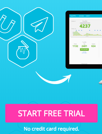
Use Contrasting Color on Your Primary CTA
If you use a button, make sure it really stands out. Like in this example on our website.
Avoid Ghost Buttons
Most web designers prefer to use similar colors to the background for CTAs. This is a no-no, if you want to get conversions and not win design competitions.
Conversion optimizers call them ghost buttons, as they are almost as effective as having no button at all.

These buttons blend to the menu bar. In this case, this is intentional as there is another primary button (shown earlier).
Unfortunately very few are ready to act on direct CTAs on their first visit. They don’t trust you or they are still on earlier stages on their customer journey. You have to build a relationship, help them move forward on their journey, and keep them coming back. An old marketing rule is that you have to get 7 touches before a sale is likely to happen (if it ever will). And to achieve all these, transitional call-to-actions are used. These are often such as “Download a free ebook”, or “Register for a free webinar”.
You provide free value in exchange of the potential customer’s email address so that you can send them further emails - automated and your company’s newsletters - to build a relationship, keep them coming back, keep the topic and you on the top of their mind, and to get those important touches needed to dip the scale on your favour.
Every Blog Post Should Have a CTA Or Three
Every blog post, in general, should have a call-to-action at the end, and possibly 1-2 already earlier. This of course depends of the length of the post. A short one will do with one, whereas for a really long post even 3 may not be enough. I am not suggesting you should repeat that same CTA three times, but to have three different call-to-actions. One might for example lead directly to your sales process, one to download your ebook and one to subscribe your newsletter, and not neccessarily in this order.
But don't follow this rule blindly. Sometimes you have a blog post in which you do not have a relevant CTA. That's ok.
It's important that the CTAs are in line with customer's journey. Do not send a later stage customer accidentally back to square one by offering content from a wrong stage.
And don't offer something that's unlikely to be relevant.
So as a rule of thumb, every blog post should have a CTA.
Every Solution, Product Or Service Page Should Have a CTA
Now on your website, the game is a bit different. We talked about above the fold part already and the front page in general. One CTA up and one at the bottom of that page is the rule of thumb here.
But how about inner pages? Well, you likely have sections for your solutions, products or services, whichever you call your products. Sometimes you have a separate page for each of them, sometimes a few on the same page.
Here the rule of thumb is to have a CTA where the customer is likely to end up while looking for the most suitable solution for her. This is typically the product page or section on a multiple product page. You may still have further pages to learn even more about your offering, but be sure to catch an interested customer when they start to know which solution, product or service interests them on your web pages most.
Here you should offer a direct call-to-action to your sales process like a free consultation to catch those who are already later on their journey. It's also a good idea to have a secondary call-to-action for downloading an ebook or similar to catch those who are just looking.
How to Create a Call-To-Action Button
A typical CTA is often a button. This works and is easy to create. This button often leads to a landing page which has a form or opens up a form straight away on top of the page or something.
So to create a CTA, you will also need to create a form and possibly a landing page where to put that form and sell the ebook, free consultation etc. you are offering. Customer always wants to know what they will actually get, so you often have to sell the free ebook or consultation and this is done on that landing page.
If you are using or planning to use Loyalistic, our complete inbound sales deck, you can create the landing page, form and CTA super quickly. Just click "Create a new honeypot" and follow the instructions. On a final stage of that process, you can create a CTA button to be copied to your blog post, website or where you need it. See below.
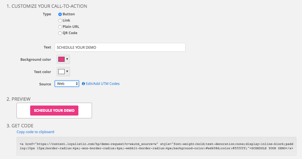
If you plan to promote your ebook, consultation etc. offline, you may want to increase conversions by offering a QR code to scan and execute that CTA quickly, e.g. "Scan this QR-code to get your free ebook now". Works great at the last slide of public presentations as well, I can report. You can do this by just changing the "Type" on the CTA builder on Loyalistic.
Now try our CTA by trying Loyalistic!
 |
Written by Antti Pietilä Antti is the founder and CEO at Loyalistic (Simple Content Marketing Software for B2B Companies) who loves to help SaaS-companies to grow at Software Entrepreneurs (@ohjelmisto_ry) and cycle. Say hello to him anytime @anttipietila. |

